Within Cause Check
Why the Chart Can Beat the Average
The same summary statistics can hide very different shapes, outliers and relationships in the underlying data.
On this page
- Four datasets with matching summaries
- Outliers, curves and leverage points
- Visual checks before causal interpretation
Page outline Jump by section
Introduction
Anscombe’s quartet is a small but powerful warning about correlation in messy outcomes: the same averages, variances, correlation coefficient and regression line can describe datasets with very different shapes. Francis Anscombe introduced the quartet in 1973 to argue that graphs are not decorative extras; they are part of serious statistical analysis. His four datasets each contain eleven x-y pairs and look almost identical in summary form, yet their scatter plots reveal four different stories: a roughly linear relationship, a curved relationship, a line distorted by an outlier, and an apparent correlation created by a single high-leverage point. [JSTOR]jstor.orgGraphs in Statistical Analysis on JSTORJSTOR Graphs in Statistical Analysis on JSTOR…
 The lesson for causal thinking is direct. A correlation may invite a causal question, but the chart shows whether the evidence is linear, curved, fragile, clustered or dominated by one observation. Before interpreting a relationship as meaningful, it is worth asking: what shape produced this number?
Four Datasets, One Set of Summaries
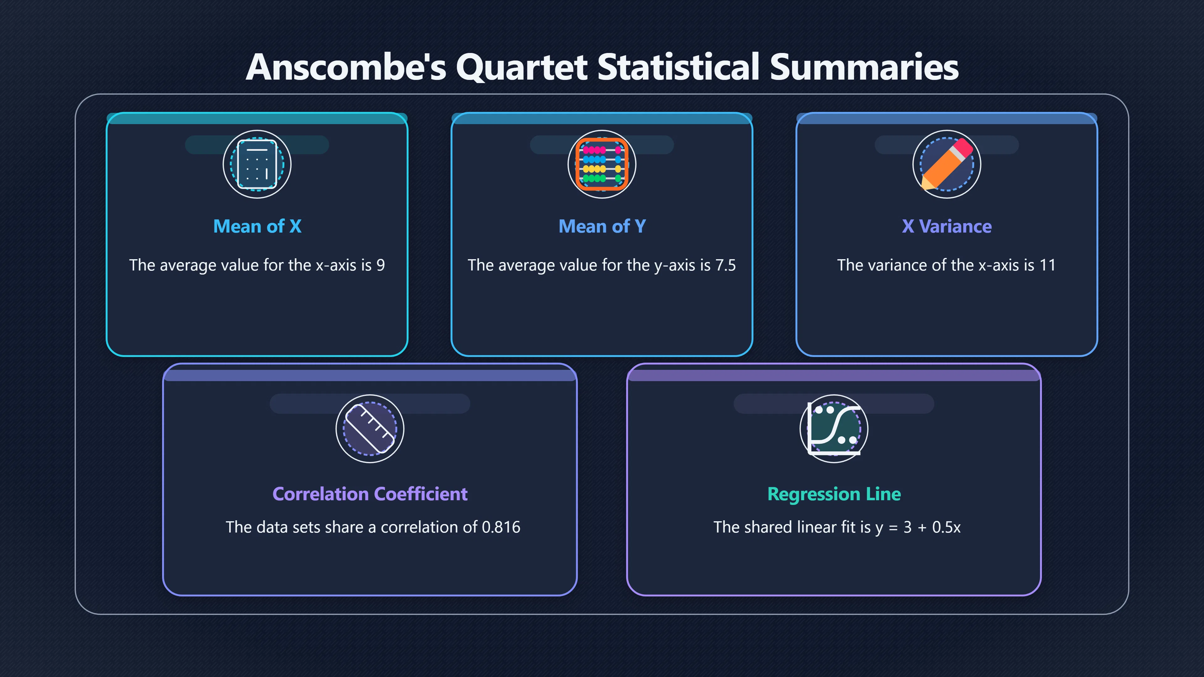
Anscombe’s quartet is deliberately unsettling because the numerical summaries agree so closely. The R statistical software documentation describes it as four x-y datasets with the same traditional statistical properties, including mean, variance, correlation and regression line, while being “quite different” when examined as data. [Seminar for Statistics]stat.ethz.chOpen source on ethz.ch.
The shared summaries include:
- Mean of x: 9.
- Mean of y: about 7.5.
- Variance of x: 11.
- Similar variance of y.
- Correlation: about 0.816.
- Regression line: approximately y = 3 + 0.5x.
If those figures were presented in a report, the tidy interpretation would be tempting: x and y have a moderately strong positive linear relationship. But the four plots reject that one-size-fits-all story.
In the first dataset, the summary is broadly honest. The points form a loose upward-sloping cloud, so a straight-line fit is a reasonable simplification. In the second, the points follow a curve, so the same linear summary hides a non-linear relationship. In the third, most points sit close to a line, but one unusual point pulls the regression line away from the pattern. In the fourth, nearly all x-values are the same, and one distant point creates the apparent relationship. [eagereyes]eagereyes.orgAnscombe's Quartet – eagereyesAnscombe's Quartet – eagereyes…
Where the Average Misleads
The quartet matters because each dataset fails in a different way. It is not just “graphs are nice”; it is that different visual shapes imply different analytical mistakes.
Averages flatten the data. Correlation compresses a relationship into one number. Regression draws the best-fitting straight line whether or not a straight line is a sensible description. Anscombe’s examples show how those summaries can be technically correct and still misleading.
The second dataset is a warning about curves. A strong relationship may exist, but not in the form assumed by a linear model. In real analysis, that could mean a treatment helps up to a threshold and then levels off, a price cut works only after a certain point, or performance improves quickly at first and then slows. A simple correlation can miss the shape that matters.
The third dataset is a warning about outliers. One observation can distort the estimated relationship. That does not automatically mean the point should be deleted: it may be a measurement error, a special case, or the most important observation in the dataset. The visual check tells the analyst that the causal story depends on understanding that point, not merely reporting the fitted line.
The fourth dataset is a warning about leverage points. A leverage point is unusual in its x-value, so it can strongly affect the slope of a regression line. In Anscombe’s fourth dataset, the appearance of a relationship is driven by one distant x-value while the rest of the data provide little evidence of a general trend. That is especially dangerous in causal interpretation, because one extreme case can make a broad claim look numerically supported.

Visual Checks Before Causal Interpretation
A scatter plot should not be treated as proof of causation. It does something more basic: it tells you what kind of evidence you are looking at. The United States National Institute of Standards and Technology describes exploratory data analysis as a set of techniques, many graphical, for gaining insight into data, testing assumptions and uncovering structure. [NIST]itl.nist.gov1. Exploratory Data Analysis1. Exploratory Data Analysis… A medical research methods chapter hosted by the US National Library of Medicine similarly describes exploratory analysis as a way to examine distributions, outliers and anomalies before formal testing. [NCBI]ncbi.nlm.nih.govNCBIExploratory Data AnalysisSecondary Analysis of Electronic Health Records - NCBI Bookshelf…
For cause-and-correlation reasoning, the useful habit is to inspect the relationship before explaining it. A visual check should ask:
- Does the relationship look roughly linear, or is it curved?
- Are there clusters that suggest different subgroups are being mixed?
- Is the pattern driven by one or two unusual observations?
- Are there gaps, ceiling effects or repeated values that make the summary statistic fragile?
- Would the apparent relationship survive if the most influential point were examined separately?
These questions do not replace causal design, fair comparison or domain knowledge. They protect those steps from starting with a false picture of the evidence.
Why the Lesson Still Holds
Anscombe’s quartet has remained influential because later examples have extended the same warning. The “Datasaurus Dozen”, created by Justin Matejka and George Fitzmaurice, showed that many dramatically different shapes can share the same means, standard deviations and correlations to two decimal places. Their method moved points gradually while preserving selected summary statistics, producing datasets that looked like very different images while retaining the same numerical summaries. [Autodesk Research]research.autodesk.comAutodesk ResearchSame Stats, Different Graphs: Generating Datasets with Varied Appearance and Identical Statistics through Simulated Anne…
That modern extension strengthens Anscombe’s original point. Summary statistics are useful compression, not full evidence. They can tell you where to look, but not always what you are seeing. In messy real-world outcomes, the shape of the data often decides whether a correlation is a clue, a modelling artefact, an outlier problem or a genuinely plausible relationship worth deeper causal investigation.

Amazon book picks
Further Reading
Books and field guides related to Why the Chart Can Beat the Average. Use these as the next step if you want deeper reading beyond the article.
The Art of Statistics
Explains why visualizing data and looking beyond summary statistics is essential for sound interpretation.
How to Lie with Statistics
Shows how statistical summaries can mislead without careful interpretation, reinforcing the lesson of Anscombe's quartet.
The Signal and the Noise
Covers interpreting data carefully, avoiding misleading patterns, and distinguishing meaningful relationships from noise.
Naked Statistics
Introduces correlation, regression, outliers, and the importance of understanding data rather than relying on formulas alone.
eBay marketplace picks
Marketplace Samples
Live-tested eBay searches with available results related to this page.


Endnotes
-
Source: jstor.org
Title: Graphs in Statistical Analysis on JSTOR
Link: https://www.jstor.org/stable/2682899Source snippet
JSTOR Graphs in Statistical Analysis on JSTOR...
-
Source: eagereyes.org
Title: Anscombe’s Quartet – eagereyes
Link: https://eagereyes.org/criticism/anscombes-quartetSource snippet
Anscombe's Quartet – eagereyes...
-
Source: itl.nist.gov
Title: 1. Exploratory Data Analysis
Link: https://www.itl.nist.gov/div898/handbook/eda/eda_d.htmSource snippet
1. Exploratory Data Analysis...
-
Source: ncbi.nlm.nih.gov
Title: NCBIExploratory Data Analysis
Link: https://www.ncbi.nlm.nih.gov/books/NBK543641/Source snippet
Secondary Analysis of Electronic Health Records - NCBI Bookshelf...
-
Source: research.autodesk.com
Link: https://www.research.autodesk.com/publications/same-stats-different-graphs/Source snippet
Autodesk ResearchSame Stats, Different Graphs: Generating Datasets with Varied Appearance and Identical Statistics through Simulated Anne...
-
Source: itl.nist.gov
Title: E Handbook
Link: https://www.itl.nist.gov/div898/handbook/toolaids/pff/E-Handbook.pdf -
Source: itl.nist.gov
Link: https://www.itl.nist.gov/div898/handbook/dtoc.htm -
Source: research.autodesk.com
Title: same stats different graphs.pdf rec2h Rj LLGg M7Cn2T
Link: https://www.research.autodesk.com/app/uploads/2023/03/same-stats-different-graphs.pdf_rec2hRjLLGgM7Cn2T.pdf -
Source: youtube.com
Title: Anscombe’s Quartet
Link: https://www.youtube.com/watch?v=MzNYJ_K3KC8Source snippet
Correlation and Regression - Why Visualization Matters (Anscombe)...
-
Source: youtube.com
Title: Correlation and Regression
Link: https://www.youtube.com/watch?v=d0aaCxS9AvsSource snippet
The strange case of Anscombe's quartet...
-
Source: stat.ethz.ch
Link: https://stat.ethz.ch/R-manual/R-devel/library/datasets/html/anscombe.html -
Source: data.europa.eu
Link: https://data.europa.eu/apps/data-visualisation-guide/correlations -
Source: r-causal.github.io
Title: datasaurus dozen
Link: https://r-causal.github.io/quartets/reference/datasaurus_dozen.html -
Source: grodri.github.io
Link: https://grodri.github.io/glms/stata/anscombe -
Source: devopedia.org
Title: exploratory data analysis
Link: https://devopedia.org/exploratory-data-analysis
Additional References
-
Source: youtube.com
Title: The strange case of Anscombe’s quartet
Link: https://www.youtube.com/watch?v=Kd–Q-aTwpMSource snippet
The video What is Anscombe's quartet? illustrates how summary statistics can be highly misleading without visualization, demonstrating ho...
-
Source: tellingstorieswithdata.com
Link: https://tellingstorieswithdata.com/11-eda.html -
Source: researchgate.net
Link: https://www.researchgate.net/publication/316652618_Same_Stats_Different_Graphs_Generating_Datasets_with_Varied_Appearance_and_Identical_Statistics_through_Simulated_Annealing -
Source: scribd.com
Link: https://www.scribd.com/document/822845260/Anscombes-Quartet -
Source: scribd.com
Link: https://www.scribd.com/doc/219802461/e-Handbook-of-Statistical-Methods-NIST-SEMATECH -
Source: reddit.com
Link: https://www.reddit.com/r/dataisbeautiful/comments/axx3kb/example_datasets_with_the_same_statistical/ -
Source: researchgate.net
Link: https://www.researchgate.net/publication/308007227_Exploratory_Data_Analysis/fulltext/57d6aa3908ae5f03b494b2e3/Exploratory-Data-Analysis.pdf -
Source: roger-beecham.com
Link: https://www.roger-beecham.com/comp-sds/class/04-class/ -
Source: linkedin.com
Link: https://www.linkedin.com/pulse/francis-anscombes-quartet-sedar-sahin-eddhe -
Source: semanticscholar.org
Link: https://www.semanticscholar.org/paper/Same-Stats%2C-Different-Graphs%3A-Generating-Datasets-Matejka-Fitzmaurice/7319234cc18a3fcaf55b57400e25f9f3114313bb
Topic Tree